The product
Beauty Pass is a rewards programme that provides customers with access to a wide range of beauty rewards. Each dollar spent earns a point which can be accumulated and used to redeem exclusive gifts. The membership tiers of Beauty Pass from lowest to highest are White, Black and Gold. White is free to all customers with a Sephora account, while members have to meet a minimum spend every 12-month period to reach Black or Gold.
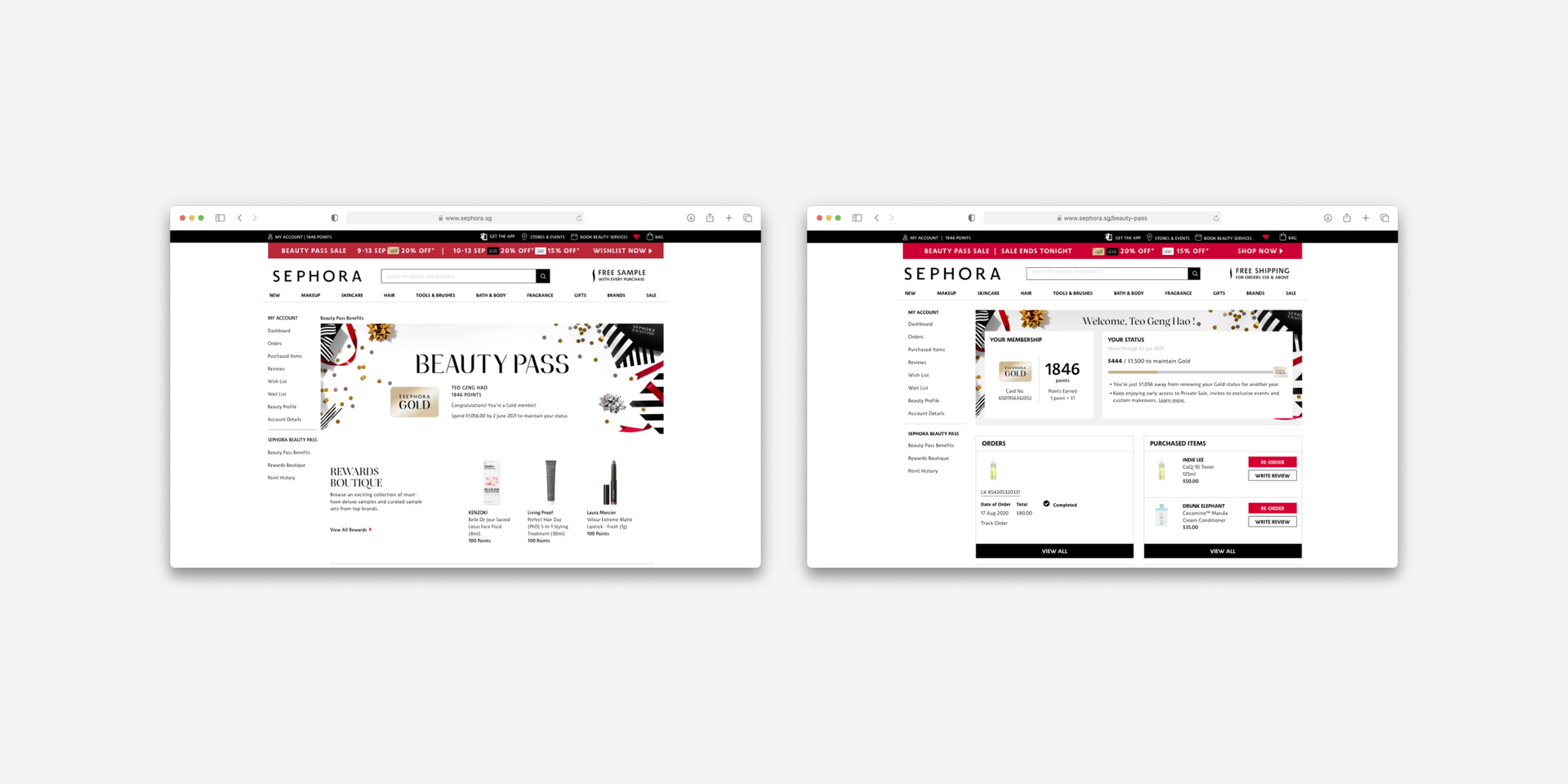
Together with my team, we redesigned some of the key touchpoints with Beauty Pass on the Sephora website for both new customers and existing members on desktop and mobile web. These include the Beauty Pass page for both new customers and existing members, and the Account Dashboard for existing members.
Beauty Pass page
Redesigning the Beauty Pass page to make it easier for customers to understand the loyalty programme and encourage them to register for an online account and become a member.
Beauty Pass page
Problem
While Beauty Pass had already been running for some time before I joined, there was room for improvement in the way we communicated the programme to customers:
- Customers didn't fully understand what Beauty Pass is about and how it works.
- The information we shared about Beauty Pass could be better aligned with what customers looked out for in a rewards programme.
- Several usability issues with the existing touchpoints of Beauty Pass made it difficult for customers to learn more about the programme.
We wanted to improve the understanding and perception of Beauty Pass among customers – thereby converting more customers into members through an increase in percentage of new online accounts created via the Beauty Pass page.
Beauty Pass page
Research
Evaluating the current situation
Before I joined the project, the team conducted an online survey via the Sephora website to collect customer feedback about what they value most in the Beauty Pass programme, and their current satisfaction levels.

A total of 348 customers responded to the survey, which was published across Sephora's desktop and mobile web platforms over a 2-week period in March – April 2018.
The team also audited the design of the existing Beauty Pass page across all device types, with a focus on information hierarchy, interaction design and visual design. Several usability issues and areas of improvement were uncovered.
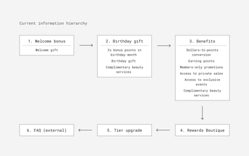
The information on the page was grouped based on milestones in the customer's membership, from Welcome, Birthday to Tier Upgrade, which meant that the most useful information to customers wasn't presented first.
The page did not highlight the unique strengths of the programme, such as the range of beauty rewards available and various membership benefits.
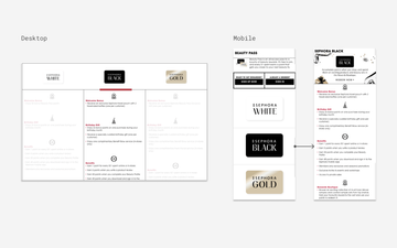
On desktop, non-selected columns for the different tiers were greyed out, making it difficult for users to read and compare benefits.
On mobile, the key value propositions of Beauty Pass weren't shown when users first landed on the page. Separate pages for each tier also made it difficult for users to compare between them.
Defining the problem
Based on our research, we decided that the redesigned Beauty Pass page should:
- Group related content together to make the page easier to scan
- Ensure content that matters most to customers is shown first
- Enable customers to easily compare between membership tiers and make informed decisions
- Maintain consistency in the design of the page across devices
- Communicate the value of Beauty Pass in a more visually interesting way
Beauty Pass page
Ideation
Having established a general direction for the redesign, we started drawing up wireframes of what the solution could look like.
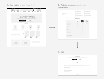
In our proposed design, we set out to make the page easier to read by grouping the information into three main chunks. The content above the fold had to clearly communicate the value proposition of the programme too.
To help customers make an empowered decision, we organised the benefits into a table for easy comparison across the different tiers, with individual rows for the perks that matter most to customers. To promote transparency, we also displayed frequently asked questions and the terms & conditions of the programme on the same page.
Our overall hypothesis was that improvements to the design of the Beauty Pass page will improve understanding of the value proposition of Beauty Pass, resulting in a higher rate of account registrations through the page. The next step was to evaluate the proposed design with customers to see where our assumptions held up and where they didn't.
Beauty Pass page
Testing
We created low-fidelity prototypes of the current and redesigned Beauty Pass page and ran a usability study with 8 participants to compare the two versions.
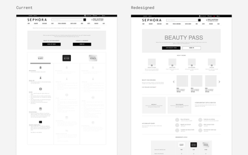
During each usability interview, we asked participants questions about the mechanics of the Beauty Pass programme. Using the new design, they looked for information such as the differences in benefits across membership tiers and points accumulation and expiry.
We also asked participants for their thoughts on the old design in terms of layout, content quality, information hierarchy and visual design.
After the participants tried using both prototypes, we asked them to complete a post-study usability questionnaire (PSSUQ) to measure their perceived satisfaction with both versions of the design. Here are the results:
4.57
6.05 +33%
Through the interviews, we managed to validate the pain points we identified in the old design from our usability audit. We also identified some areas of improvement in the new design:
- Users wanted to know when the points they had accrued would expire
- Some felt that the difference between the Black and Gold tiers was marginal and there was little incentive to upgrade to Gold
Beauty Pass page
Design
We incorporated the insights from our usability study into the high-fidelity mockups of the redesigned Beauty Pass page. I also worked with a product manager and web developer to iron out details like:
- What rewards to display for each membership tier
- The behaviour of the progress bar that reflects how many points each member has and how many more to go to reach the next tier
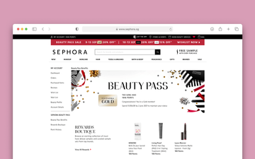
With the help of a team of visual designers and content writers, we further refined the mockups into the current Beauty Pass page, which is now live on mobile and desktop web across Singapore, Malaysia, Thailand, Philippines, Australia and New Zealand.
Account Dashboard
Enhancing the Account Dashboard to increase engagement with Beauty Pass, by making tier progression simple to understand and tailored for each customer.
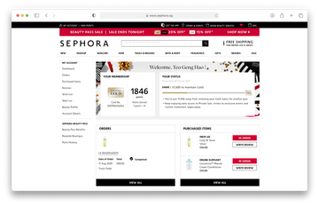
Account Dashboard
Problem
In 2017, changes to the mechanics of the Beauty Pass programme were introduced. For members to remain in the same tier, they now had to meet a minimum maintenance spend annually. Otherwise, they would be downgraded to the next lowest tier.
According to customer data from the Customer Relationship Management (CRM) team, a year after implementation, more than 70% of Black members were downgraded to White, indicating that many Beauty Pass members were not keeping up with the changes well enough.
We wanted to increase engagement with Beauty Pass among members – thereby reducing the number of downgrades and increasing the number of upgrades.
Account Dashboard
Research
Evaluating the current situation
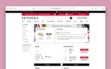
A key touchpoint of Beauty Pass for existing members is the Account Dashboard. Previously, members were informed of their tier progress through a status banner.

- Tier progress was not clear on the dashboard. Info about how much members have spent and the spend needed to remain or upgrade to the next tier was either missing or hard to understand.
- Members had little ways of tracking their tier progress on our digital platforms. They would generally rely on loyalty EDMs to be notified of their membership status.
- Members also had difficulty understanding the mechanics of Beauty Pass and their benefits, let alone keep up with changes to the programme.
We saw an opportunity to provide members with better visibility over their membership status and spend for the year. Clearly showing them how far away they are from maintaining, upgrading or downgrading their tier could help to increase engagement and encourage transactions.
Talking to customers and stakeholders
Together with another UX designer, we interviewed 7 members to learn more about how they interact with Beauty Pass when logged in on the Sephora website. We also spoke to several business stakeholders to understand their goals for Beauty Pass.
What customers want to know about their membership
- My points and how far I am from the next tier
- How to upgrade to the next tier
- My benefits and when my points will expire
- How much I've spent and past orders
Understanding the loyalty journey
To ensure that any designed solution would be aligned with the mechanics of Beauty Pass, we worked with business stakeholders to gain deeper insight into the loyalty experience at Sephora.
In general, there were four main scenarios most Beauty Pass members would face in their loyalty journey:
- Customer has been upgraded to the next tier
- Customer is in progress to reach the next tier
- Customer has maintained their tier for the year, and their spend (progress) gets reset
- Customer has been downgraded from their previous tier
Since the Beauty Pass membership is renewed annually, there were specific scenarios that happened nearer to membership renewal as well. These were key opportunities for the business to push members to maintain or upgrade their tier:
- Customer is X weeks from membership renewal and is close to a tier upgrade
- Customer is X weeks from membership renewal and is close to a tier downgrade
Defining the problem
Based on the research done, we decided to work towards encouraging Beauty Pass members to maintain and upgrade their membership tier by:
- Showing them their membership status in an intuitive way
- Providing tailored, tier-specific messaging about their membership benefits
- Making goals achievable to motivate them to advance
Account Dashboard
Ideation
Because the information had to fit into the dashboard with other sections, we landed on a horizontal card component spanning the top of the page.
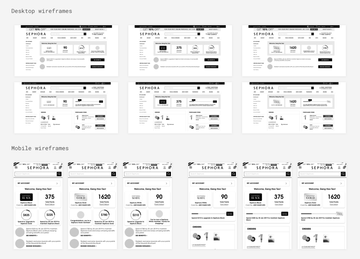
We explored several options to communicate tier progress – keeping in mind how effectively it captured the mechanics of Beauty Pass, and whether it would scale well across different devices and membership scenarios. We focused on making each member's points and progress easy to scan, and optimising the copy to fit their unique scenario.
Account Dashboard
Testing
Based on the wireframes created, we ran in-house usability tests with 5 Beauty Pass members who had made at least 1 online purchase from Sephora.
We structured the tests around the following scenarios:
- Start of first year: customer is a Black member. They are in progress towards reaching the next tier.
- End of first year: customer spent enough to maintain as a Black member, but not upgrade to the next tier. Their spend (progress) gets reset.
- End of second year: customer didn't spend enough to maintain as a Black member, and was downgraded to White.
The scenarios helped us to address the following questions:
- How effective is the design in communicating membership status and tier progress?
- How easy is it for users to understand why their membership status and tier progress have changed?
- What motivates users to upgrade or maintain their membership tier?
- How do users feel when they upgrade or downgrade their tier?
Some key places where our assumptions broke down were:
- The scenario of maintaining the same tier for the year was confusing to users. They did not understand why their progress was reset, but their tier remained the same.
- Changes to membership status and tier progress felt abrupt, and some users expected to be notified ahead of time.
Account Dashboard
Design
Based on our findings from the usability test, the team continued to refine the design of the dashboard beyond the end of my internship.
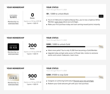
Making membership status intuitive
In the design that was launched, additional information is provided to help customers evaluate their progress. They are now able to see:
- Current membership tier and points
- Current spend (progress)
- Membership anniversary date
- Total spend required to reach next tier
- Benefits of next tier
Making goals achievable
The design is now centered around the customer's current membership status, which keeps them focused on immediate next steps: whether it's to upgrade, maintain or prevent their tier from being downgraded.
This also reduces the customer's cognitive load as they no longer need to fully grasp the mechanics of Beauty Pass to understand how to progress in their membership.
Providing personalised messaging
As the design now adapts to specific scenarios of the customer's membership, so does the messaging that they see about their benefits. This helps them to get the most out of their membership, at every step of their loyalty journey.
Reflections
My internship at Sephora Digital gave me a holistic, hands-on understanding of design thinking. I'm glad to have deepened my skills in conducting user research, and challenged myself to advocate for the customer while fulfilling business goals and acknowledging technical constraints. Importantly, all this would not have been possible without the support and guidance of my UX design team.
